I've said it before, and I'll say it again. If there's anything good that has come out of the financial crisis it's the slew of high-quality graphics to help us understand what's going on. Some visualizations attempt to explain it all while others focus on affected business. Others concentrate on how we, as citizens are affected. Some show those who are responsible. After you examine these 27 visualizations and infographics, no doubt you'll have a pretty good idea about what's going on.
Visual Guides to the Financial Crisis
Let's start things off with some comprehensive guides to the financial crisis. Several of these are from GOOD magazine's recent contest to make sense of it all.
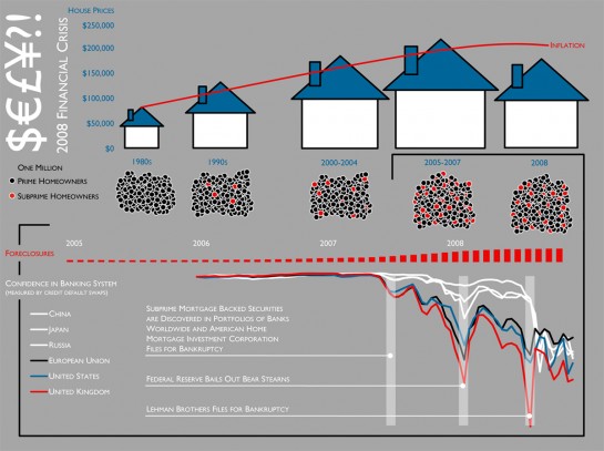
2008 Financial Crisis by Carolyn Aler and Sam Conway
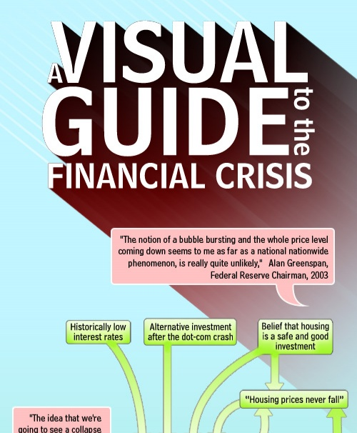
A Visual Guide to the Financial Crisis by Jess Bachman
Jess from WallStats put this together for the Mint blog. I'm pretty sure they have him on retainer.
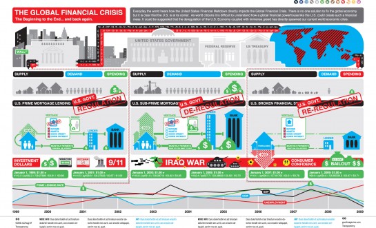
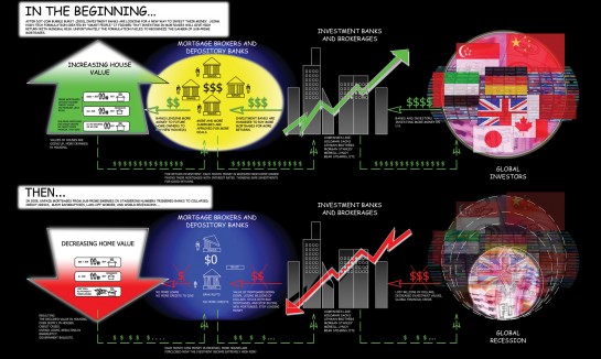
The Global Finanical Crisis by Cypher 13
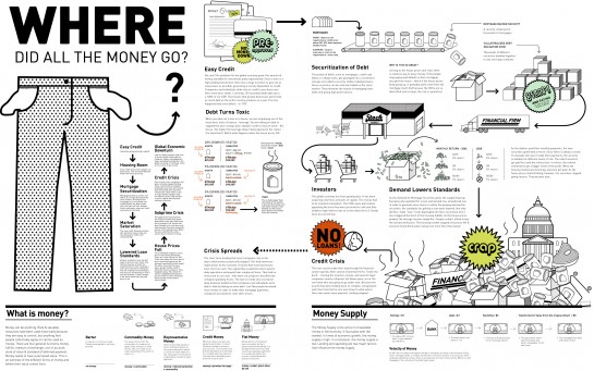
Where Did All the Money Go? by Emilia Klimiuk
From Feliciano Rahardjo
Looks like the beginning of a comic book.
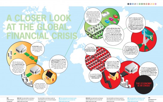
A Closer Look at the Global Financial Crisis by Liam Johnstone
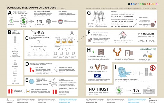
Economic Meltdown of 2008-2009 by Pei San Ng
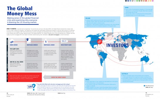
The Global Money Mess by Karen Ong
Crisis of Credit Visualized by Jonathan Jarvis
We saw this one a few days ago in animated form.
Stimulus vs Bailout Plans
OK, now that we have an idea of what's going on here, let's take a look at the stimulus/bailout plans. The government is handing out a lot of money. Where's it all going and when?
Bailout Tracker by The New York Times
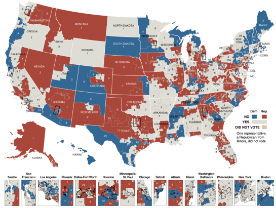
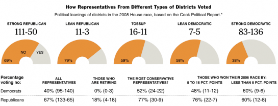
Congressional Voting on the Bailout Plan by The New York Times
Gotta go through a lot of voting before deciding whether or not to spend $700 billion.
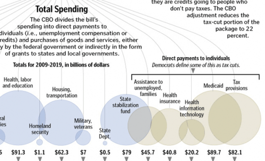
Total Spending by The Washington Post
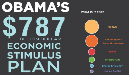
Obama's $787 billion Dollar Economic Stimulus Plan by CreditLoan
Bubbles, bubbles, and more bubbles.
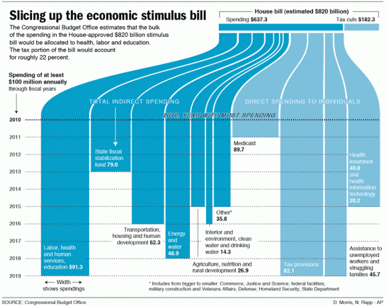
Slicing Up the Economic Stimulus Bill by Associated Press
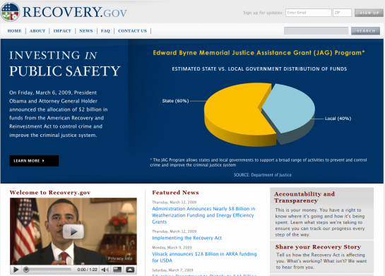
Recovery.gov from Obama Administration
The Obama administration seems to understand that it's important to provide information to the public.
Effects on Business
Will the bailout do any good? What effect has the current state of the economy had on big business?
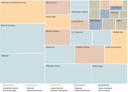
Map of the Market by The New York Times
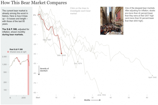
How this Bear Market Compares by The New York Times
Making Sense of Problems at Fannie and Freddie by The New York Times
Golden Parachutes by Jess Bachman
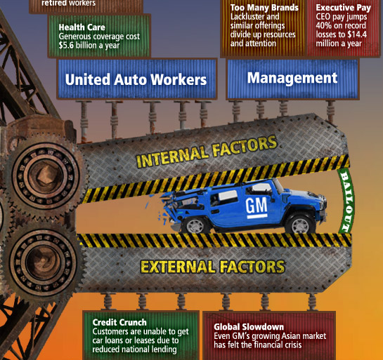
The Fall of GM by Jess Bachman
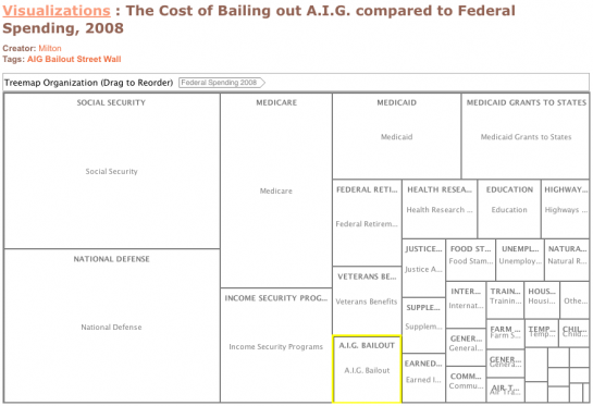
The Cost of Bailing Out AIG via Many Eyes
Effects On the Individual
Enough about business. How are you affected?
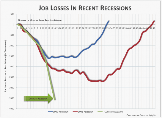
Job Losses in Recent Recessions by Time Magazine
Visualizing Money
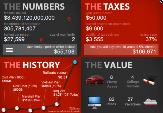
Right.org
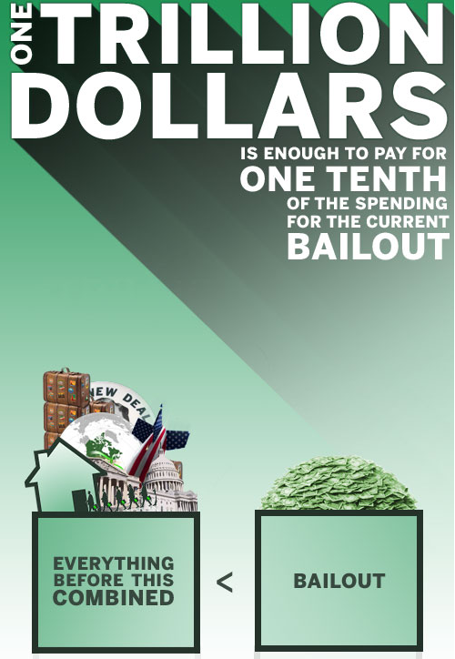
One Trillion Dollars by Mint and WallStats
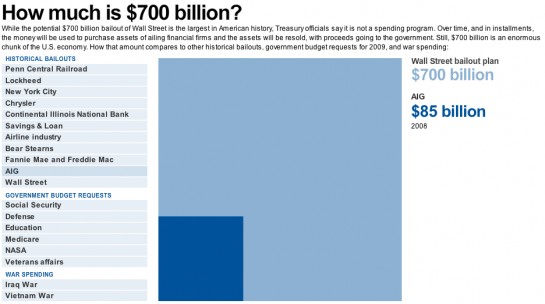
How Much is $700 billion? by USA Today
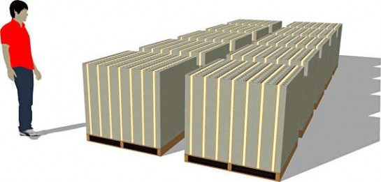
What Does One Trillion Dollars Look Like from PageTutor
Looks at Past Recessions
The best way to prepare for the future is to look at what was done in the past.
How the Government Dealt with Past Recessions by The New York Times
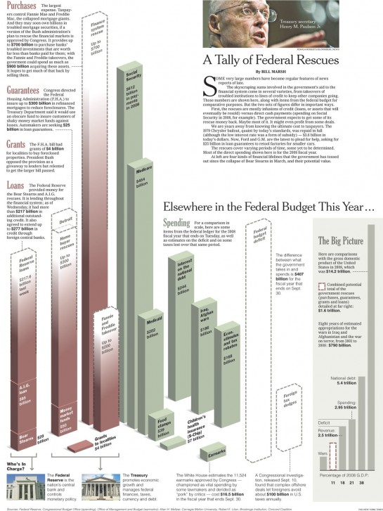
A Tally of Federal Rescues by The New York Times
See. I told you that you'd understand a this financial crisis a little better. Did I miss any other stellar graphics?
Resources:
- GOOD Magazine
- The New York Times
- USA Today
- The Wall Street Journal
- The Big Picture
- Mint
- WallStats
- Many Eyes
- Cool Infographics
Like what you see? Subscribe to the FlowingData RSS feed to stay updated on what's new in data visualization.
Sunday, November 29, 2009
27 Visualizations and Infographics to Understand the Financial Crisis | FlowingData
via flowingdata.com
Subscribe to:
Post Comments (Atom)




No comments:
Post a Comment